
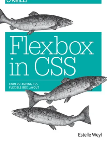
Flexbox in CSS
€6.01
Layout designers rejoice: CSS finally has an update that will make your lives easier. Flexible box layout, often called Flexbox, frees you from the challenges of creating layouts with floats and padding? and lets you specify containers and their contents instead. The new model means you can specify the directions in which material flows, how content wraps, and the ways components can expand to fill a space. Whether you’ve been creating large sites or small, fixed sites or responsive sites, flexbox will simplify your work.
Over dit boek
Be the first to review “Flexbox in CSS”
Related products

Non-Fictie

Eten & Drinken

Kunst & Architectuur

Branchen & Beroepen

Gezin & Relatie

Cultureel Nalatenschap

Eten & Drinken

Fictie & Literatuur

Cultuur & Maatschappij

Biografieën

Kinderboeken

Business & Financiën

Actie En Spanning

Entertainment


Gezin & Relatie
Reviews
There are no reviews yet.